


Edit layout
In "Edit Layout", you can specify buttons layout and behavior for each page.
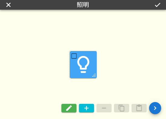
Press the "" in the lower right corner of the window to add a new button to this page. You can drag the buttons to any position within the specified range(refer to Grid rows/columns). Drag the handle at the bottom right of the button to resize it.
If you check the box at the upper left of the buttons, you can edit them all at once. Press the "" button to remove all checked buttons. You can also press "" to temporarily store the value of checked buttons and pressing "" to duplicate stored buttons. The stored buttons are shared within the browser, so you can copy and paste them between different pages. You can clear all the checks by "".
When you press the "" icon, an edit page shows on the left side of the window and you can change the value of buttons you've checked.
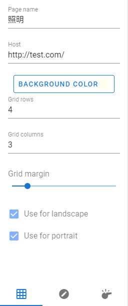
| Page name | You specify the name of this page. This name is used for the title bar and so on. |
| Host | Enter the HTTP address to send POST to when a button is pressed. If empty, dictionary "{localhost}" is used. |
| Background color | Change the background color of this page. |
| Grid rows | Specifies the maximum number of buttons that can be placed vertically. |
| Grid columns | Specifies the maximum number of buttons that can be placed horizontally. |
| Grid margin | Change the spacing between buttons. |
| Use for landscape | Enables this page when the screen is horizontal. |
| Use for portrait | Makes this page available when the screen is vertical. You can't uncheck it along with "Use for landscape". |
| Display as label | A check acts as a label. A button has no background and doesn't respond when pressed. |
| Text color | Specifies the color of the icon or text displayed on the button. |
| Button color | Specifies the color of the button background. |
| Label type | Changes the type of image shown on buttons. |
| Icon name | When the label type is “Material Icon”, enter the name of the icon to be displayed. You can use the image displayed on this site for the icon.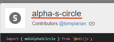 Please quote the red line for the name. The CSS modifier “mdi-” is automatically added. |
| Label text | Specifies the text to display on the button when the label type is "Text". Excess text will be hidden. |
| Label image | Specifies the image file to be displayed on the button when a label type is "Picture". Browsers that do not support IndexedDB have a limit on the size of images that can be stored (Approximately 5MB total). |
| Label size | Change the label size. |
| Border roundness | Rounds the corners of the button. When you open the bottom panel, you can resize the corners individually. |
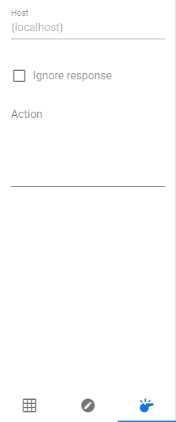
| Host | If there is an HTTP address that you want to specify only for this button, please enter it. If it is empty, the page setting or "{localhost}" is applied. |
| Ignore response | If this is checked, a warning will not be shown on the screen even if server returns a code other than HTTP200(Success). However, a communication error is always shown regardless of whether it is checked. |
| Action | You fill in the POST data. How the text works depends on the destination server. |
Press the "" at the upper left corner of the screen to discard edits or the "" at the upper right corner to reflect edits on the page to return to operation mode.
