 | Open existing files(as *.wcs). | |
 | Overwrite the current data. | |
 | Write the current data to the specified place. | |
 | Output all images containing the current data to the specified folder. | |
 | Show the parts' border. | |
 | Undo the operation. | |
 | Cancel an undo. | |
 | Cut selected parts. | |
 | Copy selected parts. | |
 | Paste parts in the cripboard. | |
 | Delete selected parts. | |
 | Adjust selected parts to the top. | |
 | Adjust selected parts to the bottom. | |
 | Adjust selected parts to the vertical center. | |
 | Adjust selected parts to the left. | |
 | Adjust selected parts to the right. | |
 | Adjust selected parts to the horizontal center. | |
 | Adjust the width of selected parts. | |
 | Adjust the height of selected parts. | |
 | Adjust the size of selected parts. | |
 | Select the page of group parts. | |
 | Back from the group/float panel. |
| Position | Set the part's area with pixel. |
| zIndex | If this value is larger, it will move to the front when it overlaps. |
| ID | The id for actions. |
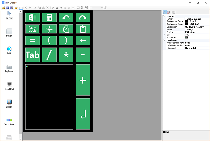
 Form
FormBasic information of the skin.
| Background Color | Color of a background. | ||||||||||||||||||||
| Background Image | Image of a background. This size becomes a basis of a skin. When there is no image, it treats as 640x480 pixels. | ||||||||||||||||||||
| Size | Shows an skin size. It can't edit. | ||||||||||||||||||||
| Name | Name of the skin. It shows on the skin manager. | ||||||||||||||||||||
| Author | Author of the skin. It shows on the skin manager. | ||||||||||||||||||||
| Description | Description of the skin. It shows on the skin manager. | ||||||||||||||||||||
| Thumbnail | Sample image. It shows on the skin manager. | ||||||||||||||||||||
| Scaling | Specify the display way when the display area and the size of the skin is not the same.
| ||||||||||||||||||||
| Front-Behind Motion | Assigns operation when a device was tilting forward and backward.
| ||||||||||||||||||||
| Left-Right Motion | Assigns operation when a device was tilting left and right. | ||||||||||||||||||||
| Placement | Criterion of a tile sensor.
|
 Button
Executes an action by toucing.
| Default Image | Image on the state of a default. | ||||||||||||||||||||||||||||||||||||||||||||||||||||||||||||||
| Pushed Image | Image on the state of pressing. | ||||||||||||||||||||||||||||||||||||||||||||||||||||||||||||||
| Circle | Touch area makes into circle when this value is True. | ||||||||||||||||||||||||||||||||||||||||||||||||||||||||||||||
| Action(Down) | Set an action when the button is pressed. You can select form decided candidates.
| ||||||||||||||||||||||||||||||||||||||||||||||||||||||||||||||
| Action(Up) | Set an action when the button was released. | ||||||||||||||||||||||||||||||||||||||||||||||||||||||||||||||
| OnSequence | Set the behavior when that button was pressed while an action is executing.
| ||||||||||||||||||||||||||||||||||||||||||||||||||||||||||||||
| Toggle | It acts as a toggle button when this value is True. |
 Stick
StickStick operation in which a value is decided by the button's position.
| Default Position | Set a default position.
| ||||||||||||||||||||||||
| Stick Image | An image of the stick. Please don't use a large image because this image becomes the moving area of the stick. | ||||||||||||||||||||||||
| Stick Type | A type of the stick.
| ||||||||||||||||||||||||
| Slider X | Input for a horizontal moving.
| ||||||||||||||||||||||||
| Slider Y | Input for a vertical moving. | ||||||||||||||||||||||||
| Stabilize | It keeps a position even if you released from the stick when this value is True. |
 Keyboard
Show the software keyboard. That keys becomes a square when an aspect is 2:5.
| Layout | Layout of the keyboard. When this value is "AppSetting", it depends on app's setting. |
| Frame Color | Color of a key frame. |
| Key Color | Color of a key. |
| Pressed Key Color | Color of a pressed key. |
| Text Color | Color of a text on a key. |
 Touchpad
Touchpad for mouse operations like on the notebook PC.
 Screen
| Display Mode | Is becomes a display mode when this value is True and False becomes a touch mode. If you want to change the mode, please use button's antion and change Enable property. |
| Display Number | Set a display number. "0" shows a primary monitor always. Other numbers are dependent on graphic output devices. |
 Group panel
This is the container that collects multiple parts. For changing the page, touches the panel or executes an action.
| Changing Animation | Set the page changing animation way.
| ||||||||||||
| Page by touch | You can move the page by touching the area when this value is True. |
Your double clicks can edit each page. To move a page, please select from the combobox on the toolbar. Each page can place buttons, sticks, keyboards, and touchpads. To back from a page, please click the button at the right of the combobox.
| Background Image | Set a background image. Location is always top-left. |
 Float panel
It sets a button at the target position and show the container when you pressed it.
| Background Color | Background color of the panel. |
| Background Image | Background image of the panel. Its location is always on the center of the panel. |
| Default Image | Default image of the button. |
| Pushed Image | Pressed image of the button. |
| Float Position | Position of the panel. |
| Frame Color | Frame color of the panel. |
| Margin | Add a margin when this value is True. |
| Scaling | Scaling child parts when those are overflow from the panel. |
| Circle | Touchable area becomes a circle when this value is True. |